Distribution of Maximal Sharpe
I recently ran across what Marcos Lopez de Prado calls "The most important plot in Finance". As I am naturally antipathetic to such outsized, self-aggrandizing claims I was resistant to drawing attention to it. However, what it purports to correct is a serious problem in quantitative trading, namely backtest overfit (variously known elsewhere as data-dredging, p-hacking, etc.). Suppose you had some process that would, on demand, generate a trading strategy, backtest it, and present you (somehow) with an unbiased estimate of the historical performance of that strategy. This process might be random generation a la genetic programming, some other automated process, or a small army of very eager quants ("grad student descent"). If you had access to such a process, surely you would query it hundreds or even thousands of times, much like a slot machine, to get the best strategy.
Before throwing money at the best strategy, first you have to identify it (probably via the Sharpe ratio on the backtested returns, or some other heuristic objective), then you should probably assess whether it is any good, or simply the result of "dumb luck". More formally, you might perform a hypothesis test under the null hypothesis that all the generated strategies have non-positive expected returns, or you might try to construct a confidence interval on the Signal-Noise ratio of the strategy with best in-sample Sharpe.
The "Most Important Plot" in all finance is, apparently, a representation of the distribution of the maximal in-sample Sharpe ratio of $B$ different backtests over strategies that are zero mean, and have independent returns, versus that $B$. As presented by its author it is a heatmap, though I imagine boxplots or violin plots would be easier to digest. To generate this plot, note that the smallest value of $B$ independent uniform random variates takes a Beta distribution with parameters $1$ and $B$. So to find the $q$th quantile of the maximum Sharpe, compute the $1-q$ quantile of the $\beta\left(1,B\right)$ distribution, then plug that the quantile function of the Sharpe distribution with the right degrees of freedom and zero Signal Noise parameter. (See Exercise 3.29 in my Short Sharpe Course.)
In theory this should give you a significance threshold against which you can compare your observed maximal Sharpe. If yours is higher, presumably you should trade the strategy (uhh, after you pay Marcos for using his patented technology), otherwise give up quantitative trading and become an accountant. One huge problem with this Most Important Plot method (besides its ignorance of entire fields of research on Multiple Hypothesis Testing, False Discovery Rate, Estimation After Selection, White's Reality Check, Romano-Wolf, Politis, Hansen's SPA, inter alia) is the assumption of independence. "Assuming quantities are independent which are not independent" is the downfall of many a statistical procedure applied in the wild (much more so than non-normality), and here is no different. And we have plenty of reason to believe returns from any real strategy generation process would fail independence:
- Strategies are typically generated on a limited universe of assets, and using a limited set of predictive 'features', and are tested on a single, often relatively short, history.
- Most strategy generation processes (synthetic and human) have a very limited imagination.
- Most strategy generation processes (synthetic and human) tend to work incrementally, generating new strategies after having observed the in-sample performance of existing strategies. They "hill-climb".
My initial intuition was that dependence among strategies, especially of the hill-climbing variety, would cause this Most Important Test to have a much higher rate of type I errors than advertised. (This would be bad, since it would effectively still pass dud trading strategies while selling you a false sense of security.) However, it seems that the more innocuous correlation of random generation on a limited set of strategies and assets causes this test to be conservative. (It is similar to Bonferroni's correction in this regard.)
To establish this conservatism, you can use Slepian's Lemma. This lemma is a kind of stochastic dominance result for multivariate normals. It says that if $X$ and $Y$ are $B$-variate normal random variables, where each element is zero mean and unit variance, and if the covariance of any pair of elements of $X$ is no less than the covariance of the corresponding pair of elements of $Y$, then $Y$ stochastically dominates $X$, in the multivariate sense. This is actually a stronger result than what we need, which is stochastic dominance of the maximal element of $Y$ over the maximal element of $X$, which it implies.
Here I simply illustrate this dominance empirically. I create a $B$-variate normal with zero mean and unit variance of marginals, for $B=1000$. The elements are all correlated to each other with correlation $\rho$. I compute the maximum over the $B$ elements. I perform this simulation 100 thousand times, then compute the $q$th empirical quantile over the $10^5$ maximum values. I vary $\rho$ from 0 to 0.75. Here is the code:
suppressMessages({
  library(dplyr)
  library(tidyr)
  library(tibble)
  library(broom)
  library(ggplot2)
  library(future.apply)
})
# one (bunch of) simulation.
onesim <- function(B,rho=0,propcor=1.0,nsims=100L) {
    propcor <- min(1.0,max(propcor,1-propcor))
    rho <- abs(rho)
    # (anti)correlated part; each row is a simulation
    X0 <- outer(array(rnorm(nsims)),array(2*rbinom(B,size=1,prob=propcor)-1))
    # idiosyncratic part
    XF <- matrix(rnorm(B*nsims),nrow=nsims,ncol=B)
    XX <- sqrt(rho) * X0 + sqrt(1-rho) * XF
    data_frame(maxval=apply(XX,1,FUN="max"))
}
# many sims.
repsim <- function(B,rho=0,propcor=1.0,nsims=1000L) {
    maxper <- 100L
    nreps <- ceiling(nsims / maxper)
  jumble <- replicate(nreps,onesim(B=B,rho=rho,propcor=propcor,nsims=maxper),simplify=FALSE) %>%
        bind_rows()
}
manysim <- function(B,rho=0,propcor=1.0,nsims=10000L,nnodes=7) {
  if ((nsims > 100*nnodes) && require(future.apply)) {
        plan(multisession, workers = 7)
    # do in parallel.
        nper <- ceiling(nsims / nnodes)
    retv <- future_lapply(1:nnodes, function(ignore) repsim(B=B,rho=rho,propcor=propcor,nsims=nper)) %>%
      bind_rows()
        plan(sequential)
        retv <- retv[1:nsims,]
  } else {
        retv <- repsim(B=B,rho=rho,propcor=propcor,nsims=nsims)
  }
  retv
}

params <- tidyr::crossing(data_frame(rho=c(0,0.25,0.5,0.75)),
                                                    data_frame(propcor=c(0.5,1.0))) %>%
  dplyr::filter(rho > 0 | propcor == 1)

# run a bunch;
nrep <- 1e5
set.seed(1234)
system.time({
    results <- params %>%
        group_by(rho,propcor) %>%
            summarize(sims=list(manysim(B=1000,rho=rho,propcor=propcor,nsims=nrep))) %>%
        ungroup() %>%
        tidyr::unnest(cols=c(sims))
})
   user  system elapsed
  3.522   0.314  44.945
# aggregate the results
do_aggregate <- function(results) {
    results %>%
        group_by(rho,propcor) %>%
            summarize(qs=list(broom::tidy(quantile(maxval,probs=seq(0.50,0.9975,by=0.0025))))) %>%
        ungroup() %>%
        tidyr::unnest(cols=c(qs)) %>%
        rename(qtile=names,value=x)
}
sumres <- results %>% do_aggregate()
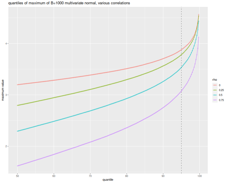
Here I plot the empirical $q$th quantile of the maximum versus $q$, with different lines for the different values of $\rho$. I include a vertical line at the 0.95 quantile, to show where the nominal 0.05 level threshold is. The takeaway, as implied by Slepian's lemma, is that the maximum over $B$ Gaussian elements decreases stochastically as the correlation of elements increases. Thus when you assume independence of your backtests, you use the red line as your significance threshold (typically where it intersects the dashed vertical line), while your processes live on the green or blue or purple lines. Your test will be too conservative, and your true type I rate will be lower than the nominal rate.
# plot max value vs quantile
library(ggplot2)
ph <- sumres %>%
    dplyr::filter(propcor==1) %>%
    mutate(rho=factor(rho)) %>%
    mutate(xv=as.numeric(gsub('%$','',qtile))) %>%
    ggplot(aes(x=xv,y=value,color=rho,group=rho)) +
    geom_line() + geom_point(alpha=0.2) +
    geom_vline(xintercept=95,linetype=2,alpha=0.5) +    # the 0.05 significance cutoff
    labs(title='quantiles of maximum of B=1000 multivariate normal, various correlations',
             x='quantile',y='maximum value')
print(ph)
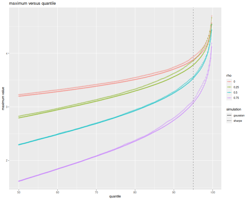
But wait, these simulations were over Gaussian vectors (and Slepian's Lemma is only applicable in the Gaussian case), while the Most Important Test is to be applied to the Sharpe ratio. They have different distributions. It turns out, however, that when the population mean is the zero vector, the vector of Sharpe ratios of returns with correlation matrix $R$ is approximately normal with variance-covariance matrix $\frac{1}{n} R$. (This is in section 4.2 of Short Sharpe Course.) Here I establish that empirically, by performing the same simulations again, this time spawning 252 days of normally distributed returns with zero mean, for $B$ possibly correlated strategies, computing their Sharpes, and taking the maximum. I only perform $10^4$ simulations because this one is quite a bit slower:
# really just one simulation.
onesim <- function(B,nday,rho=0,propcor=1.0,pzeta=0) {
    propcor <- min(1.0,max(propcor,1-propcor))
    rho <- abs(rho)
    # correlated part; each row is one day
    X0 <- outer(array(rnorm(nday)),array(2*rbinom(B,size=1,prob=propcor)-1))
    # idiosyncratic part
    XF <- matrix(rnorm(B*nday),nrow=nday,ncol=B)
    XX <- pzeta + (sqrt(rho) * X0 + sqrt(1-rho) * XF)
    sr <- colMeans(XX) / apply(XX,2,FUN="sd")
    # if you wanted to look at them cumulatively:
    #data_frame(maxval=cummax(sr),iterate=1:B)
    # otherwise just the maxval
    data_frame(maxval=max(sr),iterate=B)
}
# many sims.
repsim <- function(B,nday,rho=0,propcor=1.0,pzeta=0,nsims=1000L) {
  jumble <- replicate(nsims,onesim(B=B,nday=nday,rho=rho,propcor=propcor,pzeta=pzeta),simplify=FALSE) %>%
        bind_rows()
}
manysim <- function(B,nday,rho=0,propcor=1.0,pzeta=0,nsims=1000L,nnodes=7) {
  if ((nsims > 10*nnodes) && require(future.apply)) {
        plan(multisession, workers = 7)
    # do in parallel.
        nper <- as.numeric(table(1:nsims %% nnodes))
    retv <- future_lapply(nper, function(aper)
      repsim(B=B,nday=nday,rho=rho,propcor=propcor,pzeta=pzeta,nsims=aper)) %>%
      bind_rows()
        plan(sequential)
  } else {
        retv <- repsim(B=B,nday=nday,rho=rho,propcor=propcor,pzeta=pzeta,nsims=nsims)
  }
  retv
}

params <- tidyr::crossing(data_frame(rho=c(0,0.25,0.5,0.75)),
                                                    data_frame(propcor=c(1.0))) %>%
  dplyr::filter(rho > 0 | propcor == 1)

# run a bunch;
nday <- 252
numbt <- 1000
nrep <- 1e4
# should take around 8 minutes on 7 cores
set.seed(1234)
system.time({
    sh_results <- params %>%
        group_by(rho,propcor) %>%
            summarize(sims=list(manysim(B=numbt,nday=nday,propcor=propcor,pzeta=0,rho=rho,nsims=nrep))) %>%
        ungroup() %>%
        tidyr::unnest(cols=c(sims))
})
   user  system elapsed
 22.499   0.889 548.267
# aggregate
sh_sumres <- sh_results %>%
    dplyr::filter(iterate==1000) %>%
    do_aggregate() %>%
    mutate(value=sqrt(252) * value)   # annualize!
Again, I plot the empirical $q$th quantile of the maximum Sharpe, in annualized units, versus $q$, with different lines for the different values of $\rho$. Because we take one year of returns and annualize the Sharpe, the test statistics should be approximately normal with approximately unit marginal variances. This plot should look eerily similar to the one above, so I overlay the Sharpe simulation results with the results of the Gaussian experiment above to show how close they are. Very little has been lost in the normal approximation to the sample Sharpe, but the maximal Sharpes are slightly elevated compared to the Gaussian case.
# plot max value vs quantile
library(ggplot2)
ph <- sh_sumres %>%
    mutate(simulation='sharpe') %>%
    rbind(sumres %>% mutate(simulation='gaussian')) %>%
    dplyr::filter(propcor==1) %>%
    mutate(rho=factor(rho)) %>%
    mutate(xv=as.numeric(gsub('%$','',qtile))) %>%
    ggplot(aes(x=xv,y=value,color=rho,linetype=simulation)) +
    geom_line() + geom_point(alpha=0.2) +
    geom_vline(xintercept=95,linetype=2,alpha=0.5) +    # the 0.05 significance cutoff
    labs(title='maximum versus quantile',x='quantile',y='maximum value')
print(ph)
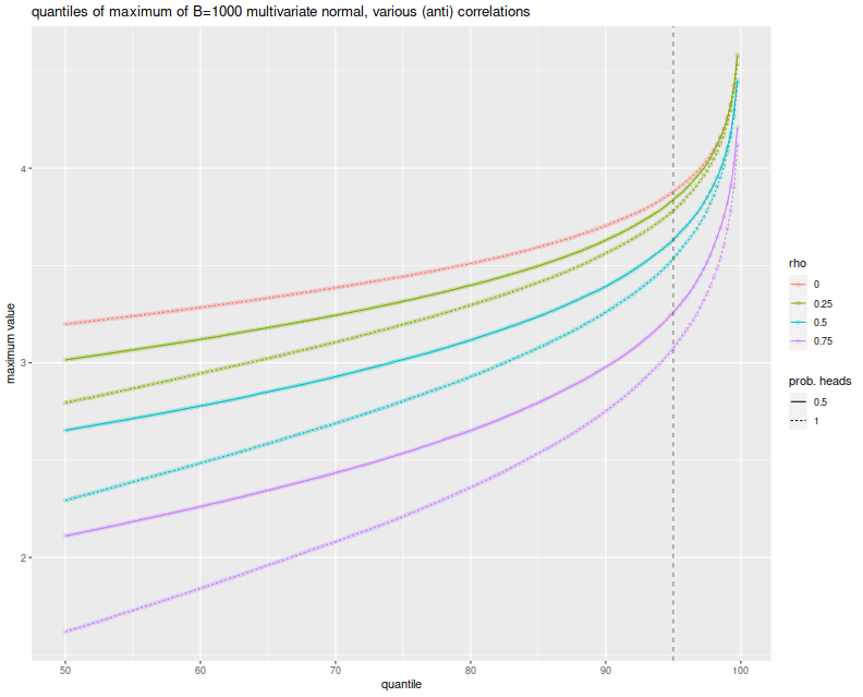
The simulations here show what can happen when many strategies have mutual positive correlation. One might wonder what would happen if there were many strategies with a significant negative correlation. It turns out this is not really possible. In order for the correlation matrix to be positive definite, you cannot have too many strongly negative off-diagonal elements. Perhaps there is a Pigeonhole Principle argument for this, but a simple expectation argument suffices.
Just in case, however, above I also simulated the case where you flip a coin to determine whether an element of the Gaussian has a positive or negative correlation to the common element. When the coin is completely biased to heads, you get the simulations shown above. When the coin is fair, the elements of the Gaussian are expected to be divided evenly into two highly groups. Here is the plot of the $q$th quantile of the maximum versus $q$, with different colors for $\rho$ and different lines for the probability of heads. Allowing negatively correlated elements does stochastically increase the maximum element, but never above the $\rho=0$ case. And so the Most Important Test still appears conservative.
# plot max value vs quantile:
library(ggplot2)
ph <- sumres %>%
    mutate(rho=factor(rho)) %>%
    mutate(`prob. heads`=factor(propcor)) %>%
    mutate(xv=as.numeric(gsub('%$','',qtile))) %>%
    ggplot(aes(x=xv,y=value,color=rho,linetype=`prob. heads`)) +
    geom_line() + geom_point(alpha=0.2) +
    geom_vline(xintercept=95,linetype=2,alpha=0.5) +    # the 0.05 significance cutoff
    labs(title='quantiles of maximum of B=1000 multivariate normal, various (anti) correlations',
             x='quantile',y='maximum value')
print(ph)
In a followup post I will attempt to address the conservatism and hill-climbing issues, using the Markowitz approximation.